UI, UX, visual and motion design
I initially worked alongside a senior product designer to help launch the product and subsequently became the sole designer working on new updates for the Credit Builder.
Jan 2022 - Oct 2022
Borrowell offers financial product recommendations based on your credit score and overall financial situation.
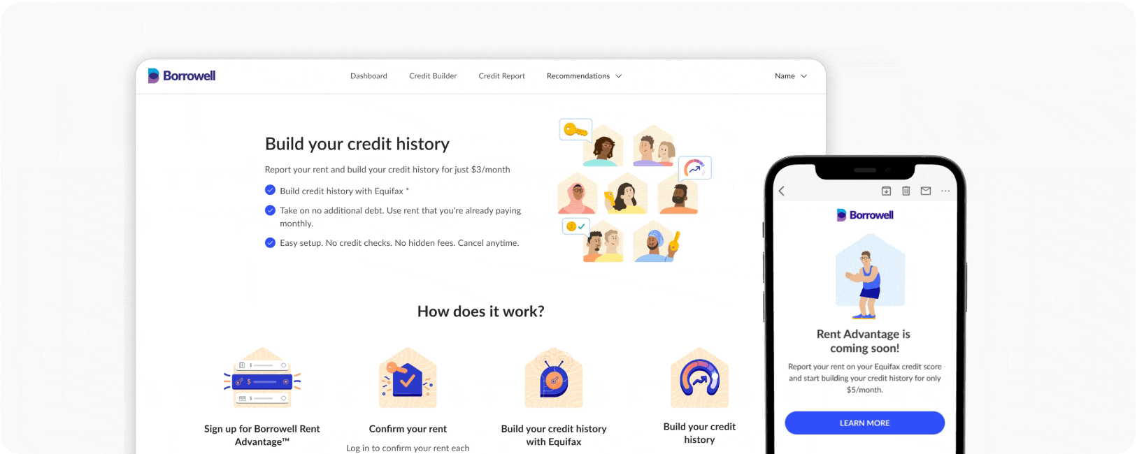
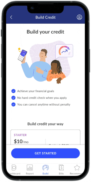
In 2022, Borrowell released two new credit-building products — Credit Builder and Rent Advantage — to help Canadians build credit affordably and reach their financial goals.
I joined the Credit Builder team alongside a senior product designer, where I was responsible for the visual branding of the new products.
After the successful launch in May 2022, I worked on designing new features and improving the UX of the Credit Builder sign-up flow and servicing dashboard.
A senior designer and I conducted user interviews to learn about users’ understanding, expectations, and perceptions of the product.
I conducted a competitor analysis by examining how banks and fintech companies presented similar financial products.
Users were skeptical about the product and its effectiveness.
Users were unfamiliar with credit-building products, so many did not understand how they worked.
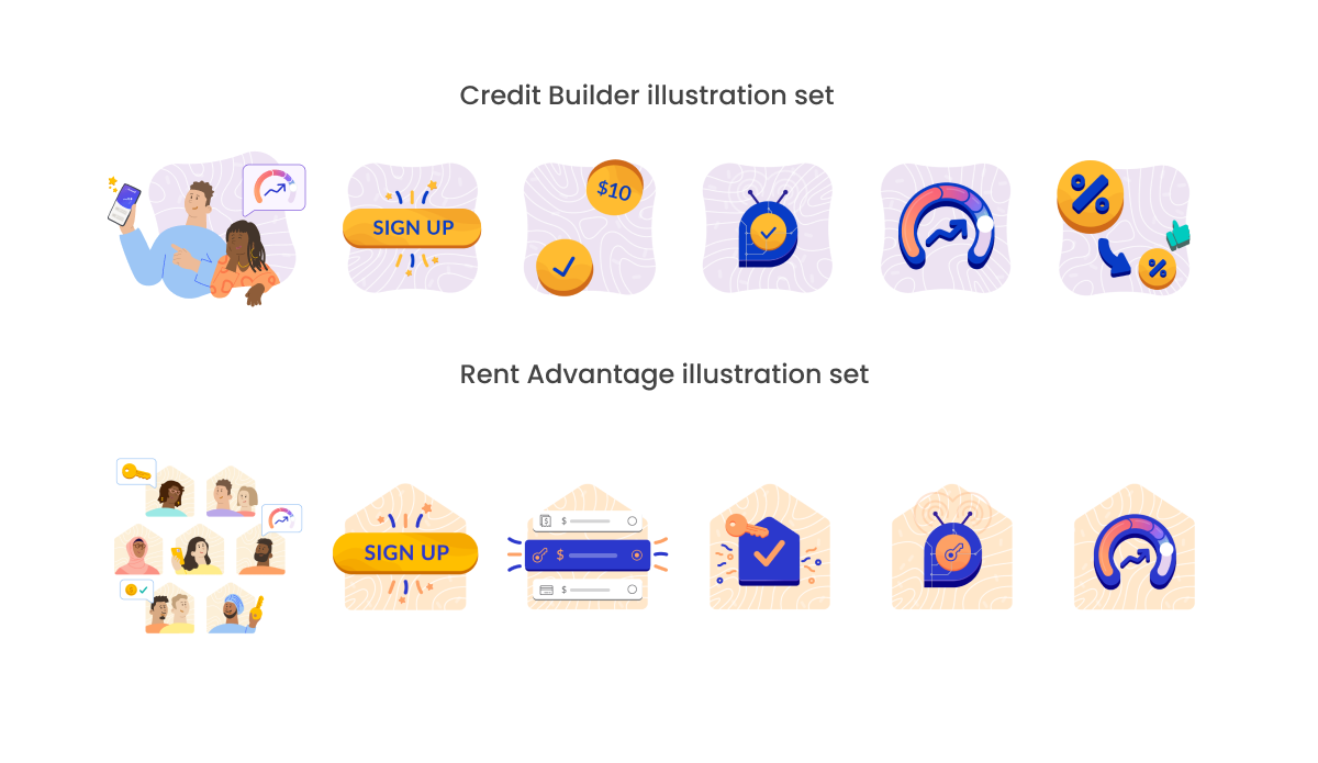
To address user concerns, I designed a visual identity that felt approachable, relatable, and accessible. I used colorful, stylized characters while building on Borrowell’s existing brand to leverage the trust users already had.
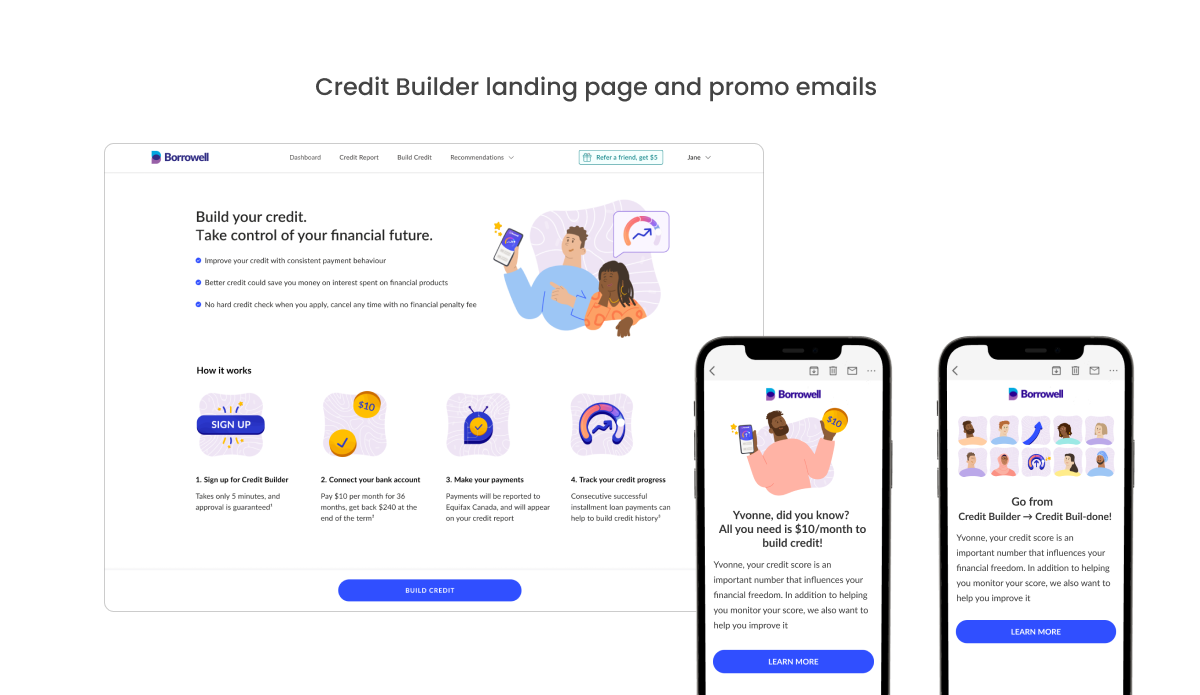
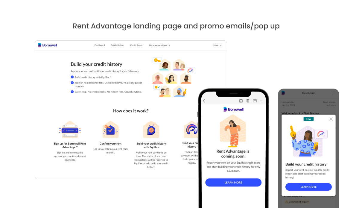
To reduce user anxiety, we focused on education by clearly explaining how the product works and highlighting options such as “cancel anytime” and “get your savings back.”

On the landing page, users see a high-level product overview along with fine print for additional details.
On step 2, users get a second opportunity to review the details, addressing any remaining doubts.
The business wanted to test three price points to reach revenue goals.
We needed an effective way to communicate the value proposition of each pricing tier.
How might we help users understand Credit Builder, given that it’s a complex product?
How might we present enough information without overwhelming users or hurting affordance?
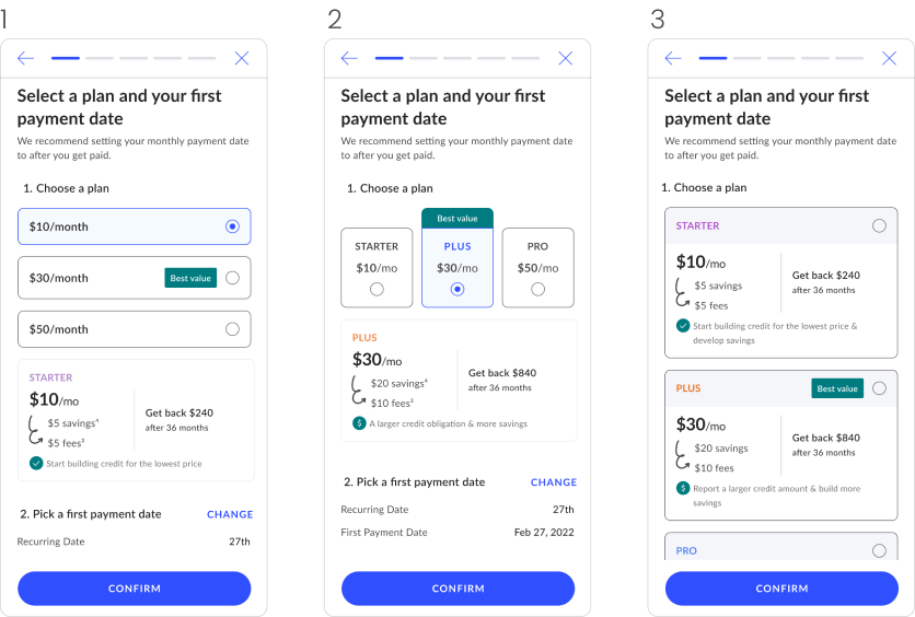
Buttons displayed minimal information, with a card revealing details for the selected option.
PRO: Good affordance.
CONS: Unselected state doesn’t show you any extra info about the options.
Buttons include a full description of your selection.
PRO: Info displayed upfront.
CONS: Takes a lot of vertical space. Affordance not optimal.
Buttons display a simplified full description in a more compact layout.
PRO: Strong affordance; all key information is included.y.
CONS: Value propositions were omitted to save space.
43% increase in revenue
76% increase in avg fee per unit
22% increase in conversion rate
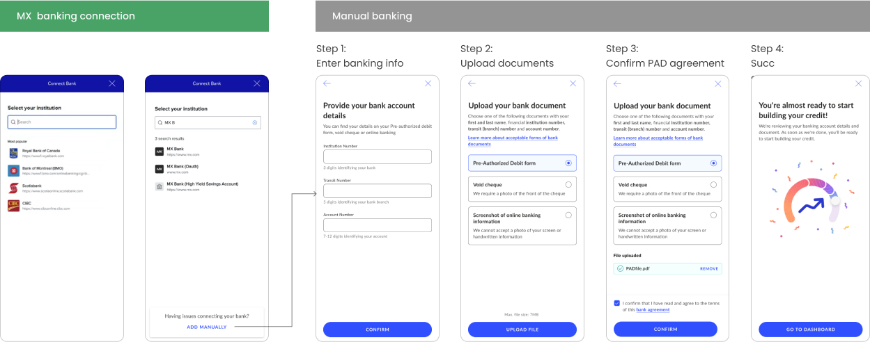
When users go through the Credit Builder application and cannot connect their bank through MX — or cannot find their bank or credit union — we needed to provide a fallback option for them to submit their banking information.
When a user begins searching for their bank, a card appears at the bottom of the screen offering the option to add their banking information manually.
Almost 10 additional Credit Builder sign ups per day
